Sorted Branding
The goal of this project was to design the brand identity for Sorted, a mobile app that helps users manage and reverse prediabetes by building healthy habits. The branding needed to convey empowerment, simplicity, and positivity, making the journey toward better health feel achievable and stress-free.
Brand Strategy
Brand Purpose
Empower individuals with prediabetes to take control of their health by making sustainable changes in nutrition, exercise, sleep, and stress.
Target Audience
Prediabetic young adults (25-40) seeking a simple tool to track habits and reverse prediabetes, especially those without access to CGMs.
Brand Positioning
Sorted focuses on sustainable lifestyle changes in nutrition, exercise, sleep, and stress management.
Visual Identity
Logo Design Process
I began experimenting with hand signs to match the app’s lighthearted approach. However, it became clear that hand signs alone did not convey the healthcare focus of the app. The design was then refined to incorporate a blood drop, directly linking to the prediabetes theme and providing context. To align with the brand name, "Sorted," a checkmark was added, symbolising progress, achievement, and the app’s goal of helping users manage their health.
Final Logo & App Icon
The Sorted logo combines a blood drop and checkmark, symbolizing healthcare, success, and the feeling of being "sorted." It reinforces the app’s mission to help users take control of their health and reverse prediabetes.
Color Palette
The Logomark is a vertical gradient from #FF7C33 to #FF4141, representing the blood drop. These colors evoke urgency, energy, and health—key elements in conveying the app’s role in helping users address their health concerns.
The Wordmark displayed in #005859, a calming deep teal that conveys trust and clarity—qualities essential in a health management tool.
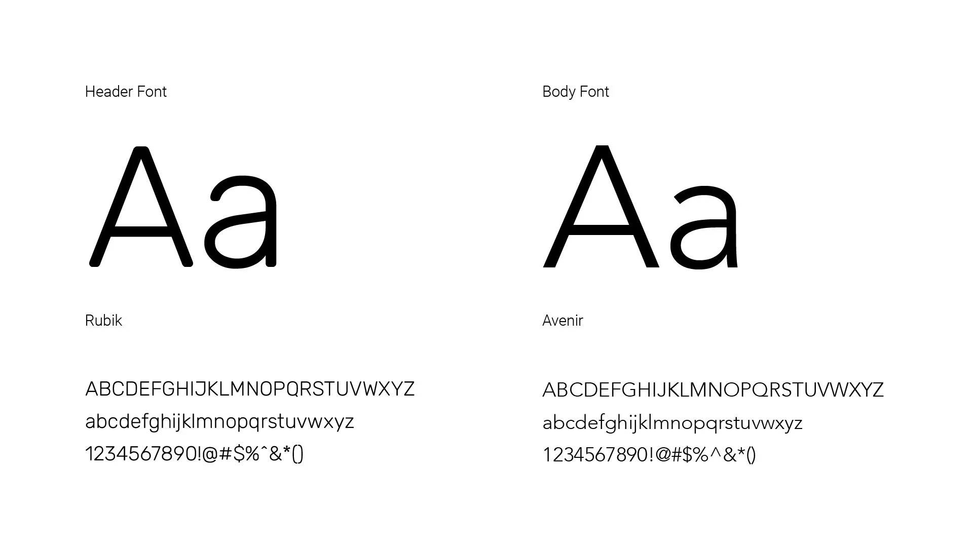
Typography
Header Font: Rubik was chosen for its modern, clean look with rounded corners, creating a friendly, professional feel.
Body Font: Avenir provides clarity and elegance, with its geometric structure ensuring easy readability on small mobile screens.
Together, these fonts balance approachability and clarity, making the app user-friendly and engaging.
Brand Messaging
Core Message
Sorted’s core message is “Healthy habits, lasting change.” It highlights that reversing prediabetes doesn’t require drastic actions—by making consistent, manageable changes, users can achieve long-term health improvements. The language is motivating, focusing on hope and empowerment.
Tone of Voice
Supportive, optimistic, and encouraging, designed to alleviate the stress often associated with health management. By framing every interaction with positivity, the app ensures that users feel motivated and capable. Messages such as “You’re doing great! Keep going!” help users stay motivated on their health journey, even when facing challenges.
Tagline
“Sort your habits, sort your health.” This reinforces the app’s step-by-step approach to improving health by focusing on simple, sustainable habits that lead to lasting wellness.
Button Design
Primary call-to-action buttons use the teal color #005859, with color shifts for interactive states to provide feedback.
UI Elements
Iconography
Icons are simple and recognizable, with action icons in the #FF7C33 to #FF4141 gradient and informational icons in #005859, ensuring a clean, consistent look.
Progress Indicators
Progress bars track user progress in meal logging, exercise, sleep, and stress, aligning with the logo’s gradient theme for an engaging, motivational experience.
Sorted’s branding effectively communicates the app’s mission to simplify managing prediabetes through a cohesive visual identity. The logo, color palette, and typography create a strong, approachable brand that conveys both trust and empowerment.
Final thoughts
A Complete Brand Guideline
To improve the brand’s consistency and professionalism, a comprehensive brand guidelines document should be created. This would cover all key elements in detail, ensuring that each design element is applied correctly across all platforms.
Ideas to Improve
Brand Mascot
Introducing a mascot or character that aligns with the Sorted brand could humanize the app and engage users emotionally. A friendly, approachable character offering encouragement or tips could make the app feel more personal and enhance brand recall.
Refined Logo
The blood drop with a checkmark is distinctive, but exploring dynamic logo animations or subtle integrations (e.g., in notifications or as a background pattern) could enhance brand engagement and reinforce its connection to health progress.


